Showing posts with label Graphic Design. Show all posts

Friday, 26 December 2008

Pokka's Poster


This is poster that I made for maketing plan in the marketing class. I think this is good way to apply what I have learnt in class. For this time, my customer is young and dynamic generation. So I create poster with two main colors in yellow and green to represent for these characteristics of youth. With the slogan is "Be green in your style", I also change its perspective and add some dot line to represent the increase in "green" trend of using "green products". Hope you like it ^^!

Wednesday, 5 November 2008

Typography

The rectangular letters
The final result.
In this entry, I try to apply the typograghy style that I have learnt in class. Furthermore, I also use the basic shape such as square and rectangular to re-create the font type instead of using the instant fonts from Illustrator. The letters are name of my favourite designers-"Paul Rand". I really inspire what he had done in design the cover book with the use of the alignment which was arranged in clever way. So that why the reason I apply the use of alignments in filling these letters instead of using color. I aslo combine these letter into a rectangular and create a reflecting letters for visual impacts

Tuesday, 4 November 2008

The Gestalt Theory


This is the entry that I did for DIM1


I have traced it and re-coloured again.


This is the final result.

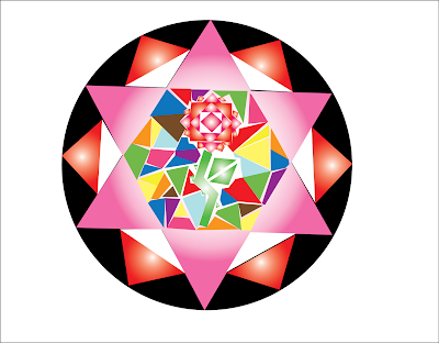
I am going to use the Gestault theory to apply in this entry. I think the combination of several kinds of basic shape and the arrangement of alignments can create an expected effects which are similar to kaleidoscope. When I was child, I often stared at the kaleiscope. For the reason, although the beautiful impacts from kaleiscope are created by simple and basic shapes like circle, square and rectangular, they still offers to the viewers plentiful of illusive shapes which like flowers with the combination of these basic shapes. So, this is what inspire me for doign this entry!!

Friday, 31 October 2008

Graphic Design

This design is the use of rebus to give definition of design. Actually, I think image contain wide meaning rather the letters. Furthermore, with the use of rebus including some simple instruction, this can create an attractive image with a deeper level of sense.


The Sun and Moon

There are numerous symbols that represent for sun and moon. For me these are not only represent for man and woman but also for day and night which is represented by the colours of white and black. The power of the Sun bring the lives to human and animal through the sun light. While the Moon with a several stars around give human a peaceful emotion after a long day working. So, it is necessary to recognize the beauty and importance of Sun and Moon.

Furthermore, I try to keep it simple that can offers peaceful and focused on main idea to viewers Hope you like it!!

There are two version with different style of brushes uses.