Friday, 28 November 2008

Assignment 1


I have picked Milton Glaser for my reseaching assignment. Because Milton reffers the beauty of simplicity - "Less is more". For created this layout, I'd like to keep it simple with the use of free spaces for flexible in human visual. For the reason, I think today magazine is too complex with the infomation that they want to provide to viewers. So why not give to viewer a better vision with the free spaces. Hope you like it!!

Thursday, 20 November 2008

Happy Teacher's day!!!


This is my card that I made for the teacher day! This is Vietnamese traditional day to display students' repect to their teachers. So, I'd like to send this card to all of our teachers!!! HAPPY TEACHER'S DAY!!!

Tuesday, 18 November 2008

Nokia Poster


This is my poster that I created for Nokia 6300. This type of mobile phone is quite classical. So I choose brown and black as two main colours. Besides that, I also make dust effect that will make the image more classical.

Thursday, 13 November 2008

Class Exercises about Photomontage


This is my work for class exercise about photomontage. I try to combine 2 provided images and make it look like human face who has blood tear with a little mystery. ^^

Wednesday, 12 November 2008

Carhartt


This is Carhartt poster which is created by me. This poster do not only provide some useful info mation about Carhartt but also offer different visual impacts to the viewers. Furthermore, I aslo use pink as the third colour including the use of negative and positive colours. In addition, there are some letters which are quite important which is highlighted by the increase of size and different colour. With the letter " Carhartt", I try to put it in the center for visual view and add the saturation of pinks.

Wednesday, 5 November 2008

Typography

The rectangular letters
The final result.
In this entry, I try to apply the typograghy style that I have learnt in class. Furthermore, I also use the basic shape such as square and rectangular to re-create the font type instead of using the instant fonts from Illustrator. The letters are name of my favourite designers-"Paul Rand". I really inspire what he had done in design the cover book with the use of the alignment which was arranged in clever way. So that why the reason I apply the use of alignments in filling these letters instead of using color. I aslo combine these letter into a rectangular and create a reflecting letters for visual impacts

Tuesday, 4 November 2008

The Gestalt Theory


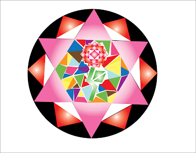
This is the entry that I did for DIM1


I have traced it and re-coloured again.


This is the final result.

I am going to use the Gestault theory to apply in this entry. I think the combination of several kinds of basic shape and the arrangement of alignments can create an expected effects which are similar to kaleidoscope. When I was child, I often stared at the kaleiscope. For the reason, although the beautiful impacts from kaleiscope are created by simple and basic shapes like circle, square and rectangular, they still offers to the viewers plentiful of illusive shapes which like flowers with the combination of these basic shapes. So, this is what inspire me for doign this entry!!