Friday, 26 December 2008

Pokka's Poster


This is poster that I made for maketing plan in the marketing class. I think this is good way to apply what I have learnt in class. For this time, my customer is young and dynamic generation. So I create poster with two main colors in yellow and green to represent for these characteristics of youth. With the slogan is "Be green in your style", I also change its perspective and add some dot line to represent the increase in "green" trend of using "green products". Hope you like it ^^!

Thursday, 25 December 2008

Sata is you!!

I know this entry can not be related to any topic. However, because of the Christmas Inpiration I did it by using some online tool. I think it it really funny! Hope you try it too!! Click on the link below to see amazing result.
!!MERRY CHRISTMAS !!
http://www.dancingsantacard.com/?santa=4557453

Saturday, 20 December 2008

DVD Cover Assignment


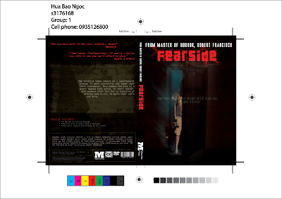
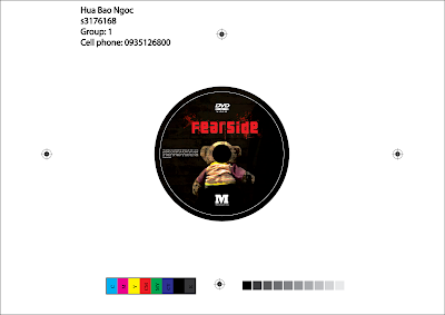
This is cover and label that I did in the assignment A2B.

For the cover, I did it based on the idea of the DVD's title "FEARSIDE". Sometime, I look at the door and I think that may be in sometime or somewhere a normal door from your own house can lead you to the other side of the world where is differed from your real world. The door is represent different sides that you need you to discover and in this case this is fear side world. That also the reason that I did the lighting effect to represent for a mystery things in the other side world that need to be found.

I aslo add a teddy bear beside me. This is not because I want to be cute or cool. For the reason, I think that when someone enters to strange world in lonely situation. So they need something liked teddy' s friend that they can feel less nervous in unfamiliar world.

In the back of cover, I create wall with girl's shadow. In this term, I like to create an curious sensor for the viewers by shadow which can be represented an mystery feeling.

For the label, in the first time, I just simply copy and paste the cover photo into it. However, when I came to meet our teacher I have changed my mind about what he had told me to improve it. I think a suitable design should be created with the interactive methods as well. Hence, I use the little hole from label as effect of emty inside of teddy bear head. This like a continued stories which linked to cover design. This can be explain in this way:

_Front Cover: the girl entered to other side with teddy.
_Back Cover: because of something happened in the fearside she lost her bear and became lonely. She tried to find hear teddy.
_Label: when the girl found teddy, she may recognized that she was a ghost or something loked that and there was an empty space inside of teddy bear when she lost her friends...

Happy T-shirt!!


Some of my friends are really interested in teddy bear or panda. So I did this entry in illustration based on my sketched papers. Hope you like it as a Xmas' gift. I aslo did a bonus extra T-shirt with my imaging logo when I had free time in pink what is one of my friends favourite colors :). Ha ha ha!!
***BONUS***

Sunday, 14 December 2008

Photomontage Assignment


This is my work for the the photomontage assignment. The main idea was taken by the relation between human and computer. With the advantages for technology, sometime people become too depending on computers which is amolst daily uses. Although they try to get out of this, it does not really work. So, in some cases, computer is controling people instead of the reversed situation. Furthermore, by this case, human become a living machine that is controlled by computers. Hence, it is hard to define that which one is actually the controller.

Saturday, 13 December 2008

Typography

This is my work for class exercise. There are still some problems between the combination between letter and sound although i have tried numerous solutions. I hope that this can be better for the second time ^^!


Wednesday, 10 December 2008

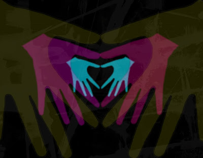
Hand in hand effect


I have read some books which mentioned about interesting use of combining tranparent colors together. In this entry, I apply the use of secondary color to create the color effect. Furthermore, I also add some texture. For the reason, as our teacher said sometimes the digital technique makes image look too flat. So by some simple skill with scanner, there are numerous useful texture canbe create.